
Uno sguardo dentro
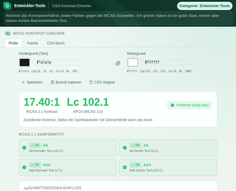
Questa anteprima sicura mostra a cosa serve lo strumento, senza eseguire azioni legate all'account.
Cosa sa fare CSS-Kontrast-Checker - Controllo del contrasto CSS
Contrast is not a matter of taste, it is accessibility. People with low vision, older users, anyone on a cheap display or in sunlight - they all live and die by the contrast between text and background. The CSS Contrast Checker makes that value visible instead of leaving it to gut feeling.
The checker computes your contrast ratio per WCAG 2.1 and tells you instantly whether your combination reaches level AA or AAA - separately for normal and large text, because different thresholds apply there. You enter foreground and background as hex, RGB, RGBA, HSL, HSLA or a CSS colour name; the checker understands all common notations.
Alongside the classic WCAG ratio, the tool also computes APCA, the Accessible Perceptual Contrast Algorithm. APCA is a draft for future WCAG versions and not binding yet. APCA judges contrast more perceptually, especially for thin fonts and in dark mode where the old ratio often gets it wrong. So you get both perspectives at a glance.
So you get not just a verdict but a solution, the checker simulates the common forms of colour blindness - protanopia (no red), deuteranopia (no green), tritanopia (no blue) and achromatopsia (no colour). And when a combination fails, the suggestion engine proposes adjusted colours that meet the requirements without completely upending your look.
For bigger jobs there are two more modes. In palette mode you check a whole colour scheme at once and see which pairings work together. In batch mode you feed in real CSS, and the checker extracts the colour values and audits them in one pass - handy when you want to test an existing design for accessibility.
This is more than an exercise: with the German Accessibility Reinforcement Act (BFSG), contrast requirements are mandatory for many digital services in Germany from June 2025. Ready-made presets - from freely chosen colours in a government style to the deliberately terrible gov-web grey disaster - show you what good and bad contrast look like in practice.
Everything runs in your browser. No colour value, no CSS snippet is sent to a server. No account, no signup, no data transfer - just fast, honest contrast values.
Funzioni
WCAG 2.1 AA and AAA
Contrast ratio per WCAG 2.1, judged separately for normal and large text.
APCA (draft, not binding)
Additionally the more perceptual APCA value, especially telling for thin fonts and dark mode.
Colour-blindness simulation
Preview for protanopia, deuteranopia, tritanopia and achromatopsia - see how others perceive your colours.
Improvement suggestions
If a combination fails, the checker suggests adjusted colours that reach the threshold.
Palette and batch audit
Check whole colour schemes at once or paste real CSS and audit all colour values in one pass.
Flexible colour input
Hex, RGB, RGBA, HSL, HSLA and CSS colour names - the checker understands all common notations.
Contrast presets
Ready-made examples from Bund.de, Elster and co. plus cautionary bad colours for direct comparison.
Come funziona
- 1
Enter your colours
Enter foreground and background - as hex, RGB, HSL or CSS colour name - or pick a preset.
- 2
Read the WCAG and APCA values
The checker shows the contrast ratio and whether AA/AAA are met, plus the APCA value.
- 3
Check colour blindness
Look at the simulations to make sure your colours also work for colour-blind viewers.
- 4
Apply suggestions
If a combination fails, take one of the suggested values or check your whole CSS in batch mode.
A chi serve
Domande frequenti
What do levels AA and AAA mean?
AA is the usual WCAG minimum: at least 4.5:1 for normal and 3:1 for large text. AAA is stricter (7:1 and 4.5:1 respectively). The checker tells you for each combination which level is met.
What is APCA and why do I need it?
APCA is the contrast method intended for WCAG 3.0. It judges contrast closer to human perception, especially for thin fonts and in dark mode where the classic WCAG ratio is often too optimistic or too strict. Both values side by side give you a fuller picture.
Is the checker relevant for BFSG compliance?
The Accessibility Reinforcement Act obliges many digital services to be accessible from June 2025, which includes sufficient contrast. The checker helps you test this requirement, but does not replace a full accessibility assessment of your entire service.
Can I check a whole CSS stylesheet?
Yes. In batch mode you paste your CSS, and the checker extracts the colour values and audits the combinations in one pass. In palette mode you check an assembled colour scheme.
Which colour formats does the checker understand?
Hex (short and long), RGB, RGBA, HSL, HSLA and the named CSS colours. You can mix notations, for example foreground as hex and background as HSL.
Are my colours stored anywhere?
No. Everything runs in your browser. No colour value and no CSS is sent to a server or stored without your action.
Strumenti simili

Farbwerkzeug - Strumento per i colori
Konvertiere zwischen HEX, RGB, HSL und CMYK. Generiere harmonische Farbpaletten.
Farbpaletten-Extraktor - Estrae la palette di colori
Extrahiere dominante Farben aus Bildern. HEX, RGB, HSL, OKLCH kopieren. Export als CSS, Tailw…

Barrierefreiheit - Accessibilità
Passe Werkzeu.ge an deine Bedürfnisse an: Textgröße, Kontrast, Animationen und Legasthenie-Sc…

Code-Werkstatt - Officina del codice
Multi-Tab-Editor mit Syntaxhervorhebung, Live-Vorschau, Konsole, 20+ Vorlagen und Snippet-Ver…

Lesbarkeits-Score - Punteggio di leggibilità
Messe die Lesbarkeit deiner Texte. Flesch-DE, Wiener Sachtextformel, Lix-Index.

Eigenes Theme - Tema personalizzato
Akzentfarbe, Schriftgröße und Dark/Light-Modus anpassen. Dein Desktop, dein Look.
Pronto per CSS-Kontrast-Checker - Controllo del contrasto CSS?
Nessuna installazione. Incluso a partire da Plus. Si apre direttamente nel browser.
Apri ora